Initial Movies UI
Flesh out the screens
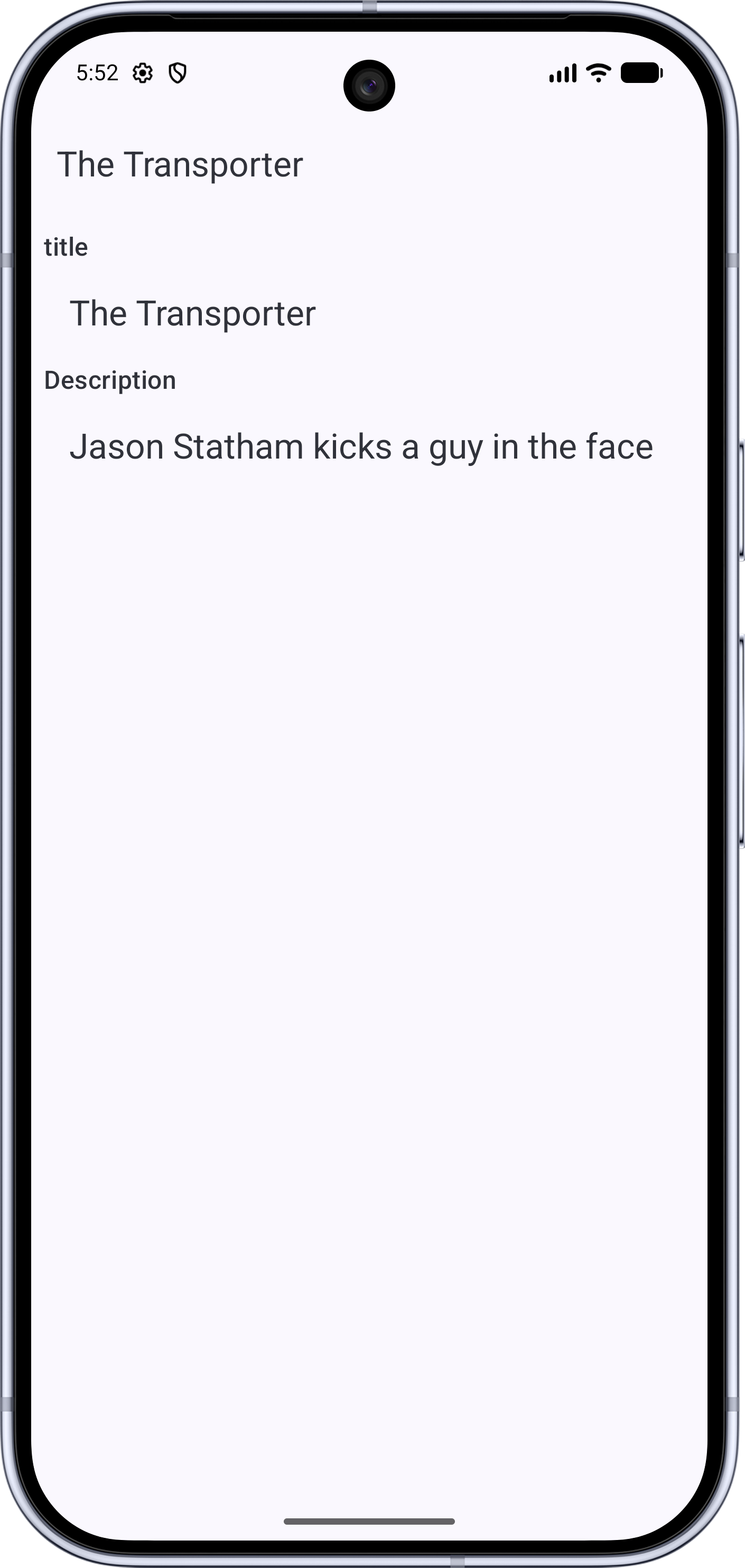
Now we flesh out the screens, making a very simple (but inefficient) list, and a simple display.
Our MovieDisplay sets up a Column as the main content of the Scaffold. Note
the paddingValues that are passed to the content lambda. These define the padding you must use
to avoid overlapping with other slots in the Scaffold.
show in full file app/src/main/java/com/androidbyexample/movies/screens/MovieDisplayUi.kt
// ...

@OptIn(ExperimentalMaterial3Api::class)
@Composable
fun MovieDisplayUi(
    // ...
) {
    Scaffold(
        // ...
        modifier = modifier,
    ) { innerPadding ->
//      Text(
//          text = "Movie Display: ${movie.title}",
//          modifier = Modifier.padding(innerPadding),
//      )
        Column(
            modifier = modifier
                .padding(innerPadding)
                .verticalScroll(rememberScrollState())
        ) {
            Label(textId = R.string.title)
            Display(text = movie.title)
            Label(textId = R.string.description)
            Display(text = movie.description)
        }
    }
}
Our Column is scrollable and stacks Labels and Displays to show the details
of a movie. (Be sure to use our Label instead of the Material3 Label)
MovieListUi is a bit more complex. It uses a Scaffold in the same way as MovieDisplay,
but the contents of its column are dynamic. We iterate through the list of movies
using forEach, and create a nice little Card for each movie, showing an icon and title.
show in full file app/src/main/java/com/androidbyexample/movies/screens/MovieListUi.kt
// ...

@OptIn(ExperimentalMaterial3Api::class)
@Composable
fun MovieListUi(
    // ...
) {
    Scaffold(
        // ...
        modifier = modifier,
    ) { innerPadding ->
//      Text(
//          text = "Movie List",
//          modifier = Modifier
        Column(
            modifier = modifier
                .padding(innerPadding)
//              .clickable {
//                  onMovieClicked(movies[0])
//              }
                .verticalScroll(rememberScrollState())
                .padding(
                    start = 8.dp,
                    end = 8.dp
                )
        ) {
            movies.forEach { movie ->
                Card(
                    elevation = CardDefaults.cardElevation(
                        defaultElevation = 8.dp,
                    ),
                    onClick = {
                        onMovieClicked(movie)
                    },
                    modifier = Modifier.padding((8.dp))
                ) {
                    Row(
                        verticalAlignment = Alignment.CenterVertically,
                        modifier = Modifier.padding(8.dp),
                    ) {
                        Icon(
                            painter = painterResource(R.drawable.movie_24),
                            contentDescription = stringResource(R.string.movie),
                        )
                        Display(text = movie.title)
                    }
                }
            }
        }
    }
}
We make the icon and title line up nicely by adding an alignment specification.
By defining onClick at the Card level,
show in full file app/src/main/java/com/androidbyexample/movies/screens/MovieListUi.kt
// ...

@OptIn(ExperimentalMaterial3Api::class)
@Composable
fun MovieListUi(
    // ...
) {
    Scaffold(
        // ...
    ) { innerPadding ->
        // ...
        Column(
            // ...
        ) {
            movies.forEach { movie ->
                Card(
                    // ...
                        defaultElevation = 8.dp,
                    ),
                    onClick = {
                        onMovieClicked(movie)
                    },
                    modifier = Modifier.padding((8.dp))
                ) {
                    // ...
                }
            }
        }
    }
}
the user can click anywhere inside the card to select the movie. That click passes the
movie for that card to onMovieClicked(), informing the caller that a movie has been
selected.
As usual, define any literal strings that the user will see in
app/src/main/res/values/strings.xml.
But what about the icon? We need to create a drawable resource to represent it as a series of SVG (Scalable-Vector-Graphics) commands.
Browse to Google Fonts - Icons. These are modern icons for use online and an Android applications.
Search for "Movie", and click on the "Movie" icon.
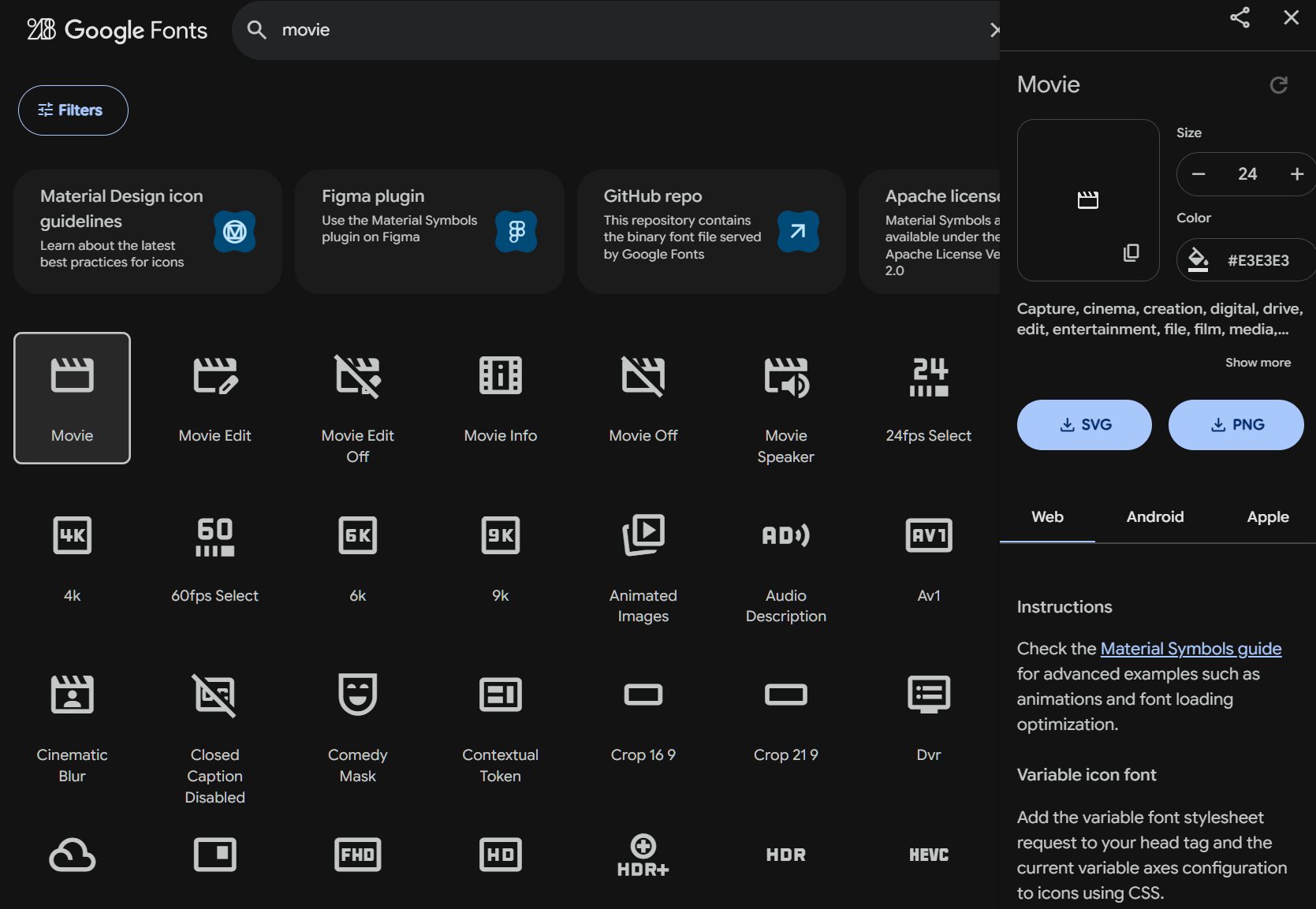
Click the "SVG" button on the right to download the file.
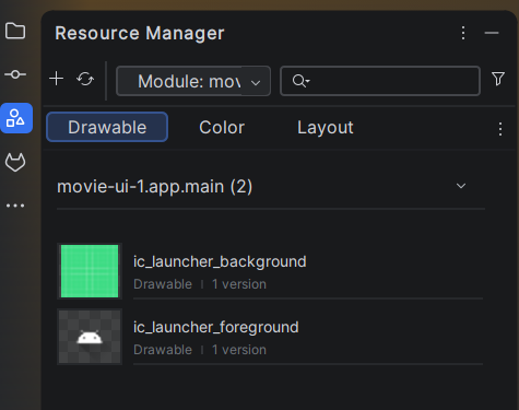
Go to the Resource Manager in Android Studio
Click the "+" icon and choose "Import Drawables".
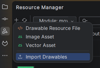
Shorten the name to "movie_24" (as in 24dp), press Next and Import.
The movie icon will now be available as R.drawable.movie_24, where R is the generated
resource index class located in your application's main package (in this case,
com.androidbyexample.movies).
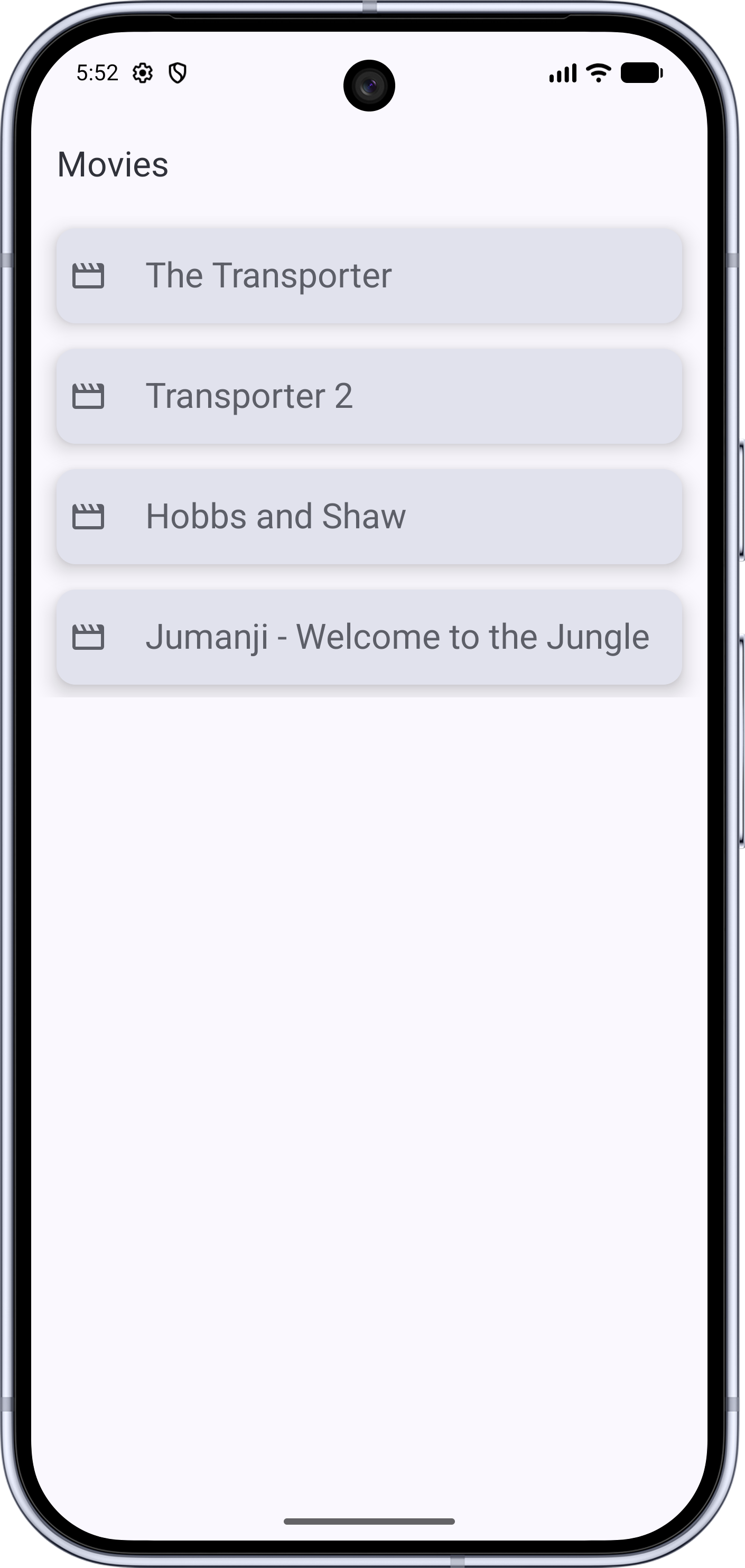
Running the application will result in a nice set of cards for the movie list and a better movie display, with field titles and indented values.
When we run, we now see a reasonable user interface!
All code changes
CHANGED: app/src/main/java/com/androidbyexample/movies/screens/MovieDisplayUi.kt
package com.androidbyexample.movies.screens

import androidx.compose.foundation.layout.Column
import androidx.compose.foundation.layout.padding
import androidx.compose.foundation.rememberScrollState
import androidx.compose.foundation.verticalScroll
import androidx.compose.material3.ExperimentalMaterial3Api
import androidx.compose.material3.Scaffold
import androidx.compose.material3.Text
import androidx.compose.material3.TopAppBar
import androidx.compose.runtime.Composable
import androidx.compose.ui.Modifier
import com.androidbyexample.movies.R
import com.androidbyexample.movies.data.Movie
import com.androidbyexample.movies.helper.Display
import com.androidbyexample.movies.helper.Label

@OptIn(ExperimentalMaterial3Api::class)
@Composable
fun MovieDisplayUi(
    movie: Movie,
    modifier: Modifier = Modifier,
) {
    Scaffold(
        topBar = {
            TopAppBar(
                title = {
                    Text(text = movie.title)
                }
            )
        },
        modifier = modifier,
    ) { innerPadding ->
//      Text(
//          text = "Movie Display: ${movie.title}",
//          modifier = Modifier.padding(innerPadding),
//      )
        Column(
            modifier = modifier
                .padding(innerPadding)
                .verticalScroll(rememberScrollState())
        ) {
            Label(textId = R.string.title)
            Display(text = movie.title)
            Label(textId = R.string.description)
            Display(text = movie.description)
        }
    }
}
CHANGED: app/src/main/java/com/androidbyexample/movies/screens/MovieListUi.kt
package com.androidbyexample.movies.screens

//import androidx.compose.foundation.clickable
import androidx.compose.foundation.layout.Column
import androidx.compose.foundation.layout.Row
import androidx.compose.foundation.layout.padding
import androidx.compose.foundation.rememberScrollState
import androidx.compose.foundation.verticalScroll
import androidx.compose.material3.Card
import androidx.compose.material3.CardDefaults
import androidx.compose.material3.ExperimentalMaterial3Api
import androidx.compose.material3.Icon
import androidx.compose.material3.Scaffold
import androidx.compose.material3.Text
import androidx.compose.material3.TopAppBar
import androidx.compose.runtime.Composable
import androidx.compose.ui.Alignment
import androidx.compose.ui.Modifier
import androidx.compose.ui.res.painterResource
import androidx.compose.ui.res.stringResource
import androidx.compose.ui.unit.dp
import com.androidbyexample.movies.R
import com.androidbyexample.movies.data.Movie
import com.androidbyexample.movies.helper.Display

@OptIn(ExperimentalMaterial3Api::class)
@Composable
fun MovieListUi(
    movies: List<Movie>,
    modifier: Modifier = Modifier,
    onMovieClicked: (Movie) -> Unit,
) {
    Scaffold(
        topBar = {
            TopAppBar(
                title = {
                    Text(text = "Movies")
                }
            )
        },
        modifier = modifier,
    ) { innerPadding ->
//      Text(
//          text = "Movie List",
//          modifier = Modifier
        Column(
            modifier = modifier
                .padding(innerPadding)
//              .clickable {
//                  onMovieClicked(movies[0])
//              }
                .verticalScroll(rememberScrollState())
                .padding(
                    start = 8.dp,
                    end = 8.dp
                )
        ) {
            movies.forEach { movie ->
                Card(
                    elevation = CardDefaults.cardElevation(
                        defaultElevation = 8.dp,
                    ),
                    onClick = {
                        onMovieClicked(movie)
                    },
                    modifier = Modifier.padding((8.dp))
                ) {
                    Row(
                        verticalAlignment = Alignment.CenterVertically,
                        modifier = Modifier.padding(8.dp),
                    ) {
                        Icon(
                            painter = painterResource(R.drawable.movie_24),
                            contentDescription = stringResource(R.string.movie),
                        )
                        Display(text = movie.title)
                    }
                }
            }
        }
    }
}
ADDED: app/src/main/res/drawable/movie_24.xml
<vector xmlns:android="http://schemas.android.com/apk/res/android"
    android:width="24dp"
    android:height="24dp"
    android:viewportWidth="960"
    android:viewportHeight="960">
  <path
      android:pathData="m160,160 l80,160h120l-80,-160h80l80,160h120l-80,-160h80l80,160h120l-80,-160h120q33,0 56.5,23.5T880,240v480q0,33 -23.5,56.5T800,800L160,800q-33,0 -56.5,-23.5T80,720v-480q0,-33 23.5,-56.5T160,160ZM160,400v320h640v-320L160,400ZM160,400v320,-320Z"
      android:fillColor="#e3e3e3"/>
</vector>
CHANGED: app/src/main/res/values/strings.xml
<resources>
    <string name="app_name">Movies</string>
    <string name="movies">Movies</string>
    <string name="title">title</string>
    <string name="description">Description</string>
    <string name="movie">Movie</string>
</resources>