Compose Text Fields
Overview
TextFields allow the user to enter text in your application. They follow the same basic pattern we've seen for other composable functions:
- Value to display passed in
- Event function to inform caller that the user wants to change something
For example:
@Composable
fun SomeComposable() {
   var name by remember { mutableStateOf("") }

   TextField(
         value = name,
         onValueChange = { name = it },
   )
}
The TextField has some internal state to manage the cursor location, selections and the edit the user is making, but the value to be displayed is managed outside of it.
However, this initial version of the API made it easy to create race conditions by launching an asynchronous update via onValueChange. This could result in some very unusual behavior, such as some letters being missing or the cursor jumping to unexpected places in the text field.
To fix this, a new version of the API was developed, where the text being edited is stored in a TextFieldState object. This hides the value and onValueChange cycle.
The new approach looks like this:
@Composable
fun SomeComposable() {
    val nameState = rememberTextFieldState("")

    TextField(
        state = nameState,
    )
}
There are three main types of text fields:
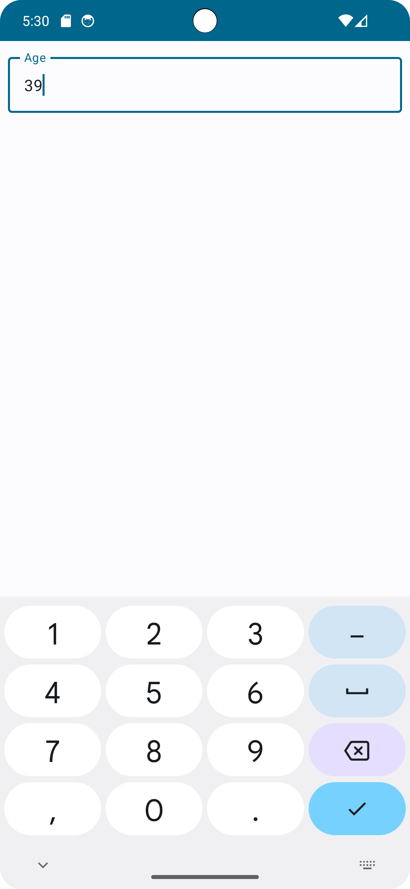
BasicTextField- the basic operations without decorations like background or outlines. You normally won't use this one unless you're creating a very custom field.TextField- a text field with a backgroundOutlinedTextField- a textfield with a border around it
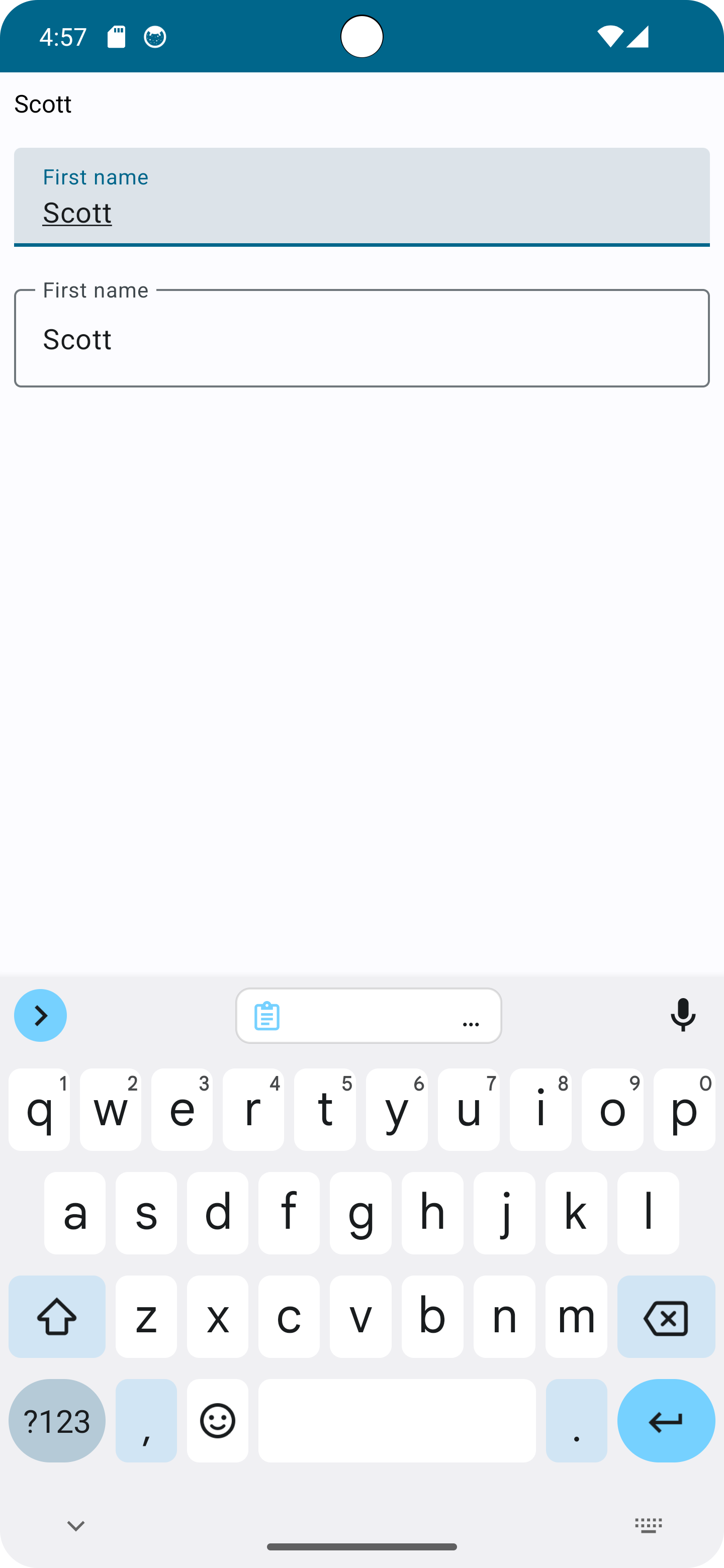
The TextField and OutlinedTextField also allow you to specify a placeholder that appears when no text is present, or a label, which acts like a placeholder until text is entered, and then moves/shrinks to remain visible as a label.
For example, here are the three types of text fields, with no entry, then after some text has been entered. All three are displaying the same state. I've added a background color to the BasicTextField to make it a little more obvious where it is.
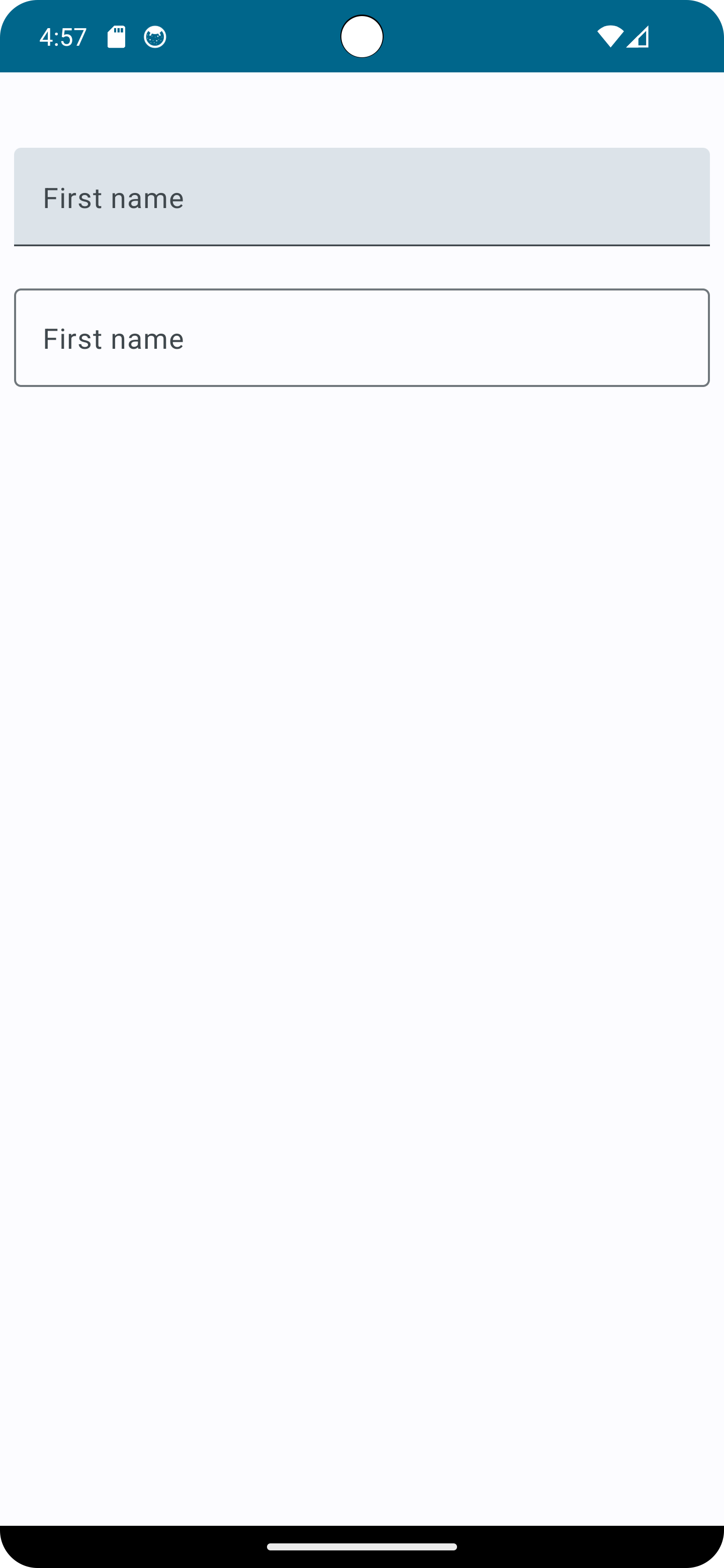
Code for the above looks like:
val nameState = rememberTextFieldState("")
Column(modifier = modifier) {
   BasicTextField(
      state = nameState,
      modifier = Modifier
            .padding(8.dp)
            .fillMaxWidth()
            .background(color = Color.LightGray)
            .padding(8.dp),
   )
   TextField(
      state = nameState,
      label = { Text(stringResource(R.string.first_name))},
      modifier = Modifier
            .padding(8.dp)
            .fillMaxWidth(),
   )
   OutlinedTextField(
      state = nameState,
      label = { Text(stringResource(R.string.first_name))},
      modifier = Modifier
            .padding(8.dp)
            .fillMaxWidth(),
   )
}
We won't be covering all of the details of the text fields here, but there's quite a bit of customization, including the number of visible lines (as well as allowing/disallowing new lines), styles, but as a quick example, suppose we wanted to allow the user to enter and search for an email address (a bit contrived here, but roll with me)
val nameState = rememberTextFieldState("")
OutlinedTextField(
   state = nameState,
   leadingIcon = {
      Icon(
            painter = painterResource(R.drawable.mail_24),
            contentDescription = stringResource(R.string.email)
      )
   },
   label = { Text(stringResource(R.string.email))},
   keyboardOptions = KeyboardOptions(
      imeAction = ImeAction.Search,
      keyboardType = KeyboardType.Email
   ),
   onKeyboardAction = {
      // perform the search
   },
   modifier = modifier
      .padding(8.dp)
      .fillMaxWidth(),
)
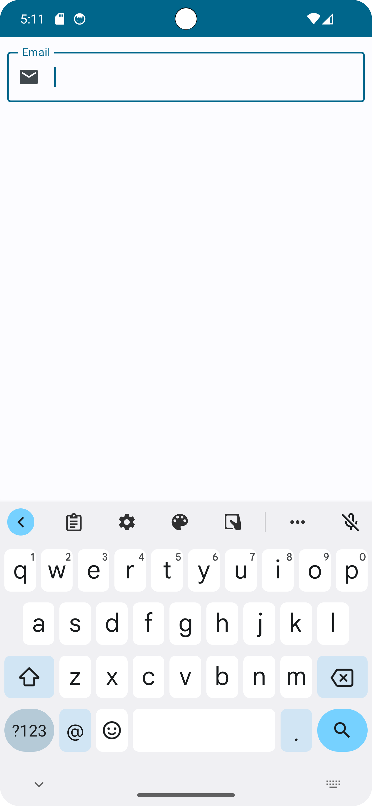
A few things to note in the above:
- Leading icons can help set off individual fields, if they're reasonably obvious.
-
Keyboard types are hints to the keyboard. Not all keyboards support all types. In this example, we hint to the keyboard that the field is for email. Many keyboards, such as the one displayed in the picture, will change some of the keys to make it easier for the user to enter the field. In this example, we see a convenient "@" key. Other keyboard types, such as Uri and Number may display differently.
But again - these are just hints and not all keyboards may support all hints.
-
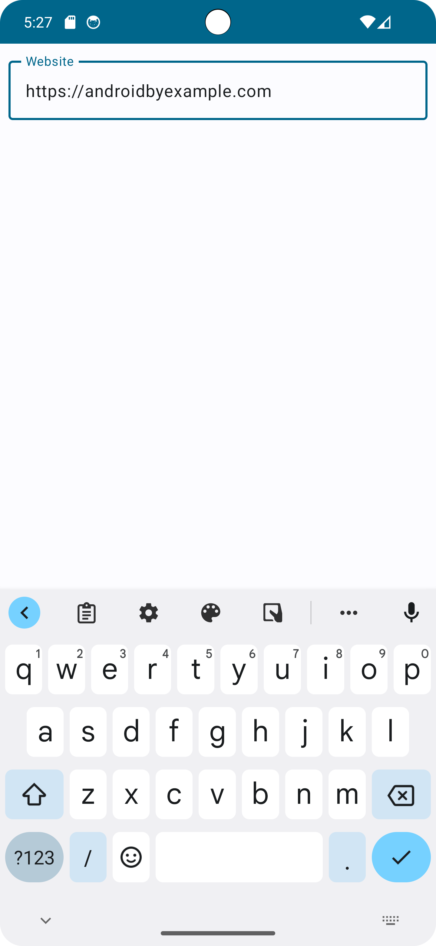
Keyboard imeAction is a hint to the keyboard about treatment of the "enter" key. Keyboards typically use imeAction to determine what to display on the enter key. In this example, we asked for "search", so a magnifying glass is displayed. Other typical actions may represent sending a message or moving to the next field on the screen.
-
Keyboard actions allow you to specify what to do when the action is pressed.