Movies UI - Lists
Selections in the UI
Let's integrate selections into the UI. We'll use the common approach of
- Tapping the icon or long-pressing anywhere in the row toggles the selection
- Tapping in the row anywhere except the icon:
- if any items are selected, toggle this item
- if no items are selected, trigger navigation
First, we need to track the selections somewhere. Selections are data that are typically not kept between runs of an application, so there's no need to store them in the database.
We could track these in the view model, but we don't need access to the selection ids there.
It's best to try to keep state that's only used in a UI as low in the UI as possible, in this case,
in the same composable as the list that uses it. For now, this is MovieListUi.
In addition, when Compose is no longer emitting nodes for that part of the Ui, the selections will no longer be tracked. This clears the selections as we visit other parts of the UI.
We usually want selections to persist across configuration changes (such as device rotation),
so we need to be sure we're using rememberSaveable instead of remember. The rememberSaveable
function will keep track of its data across configuration changes.
First, we add the data to track the selections. We use a the MutableStateSet that Compose provides
so it will be aware of changes and recompose automatically
show in full file app/src/main/java/com/androidbyexample/movies/screens/MovieListUi.kt
// ...

@OptIn(ExperimentalMaterial3Api::class)
@Composable
fun MovieListUi(
    // ...
    onResetDatabase: () -> Unit,
) {
    val selectedIds = rememberSaveable { mutableStateSetOf<MovieId>()}

    fun onSelectionToggle(id: MovieId) {
        if (id in selectedIds) {
            selectedIds -= id
        } else {
            selectedIds += id
        }
    }

    fun clearSelectedIds() {
        selectedIds.clear()
    }

    Scaffold(
        // ...
}
We choose the color of each card based on its selection status. (Note that contentColorFor will
only work if the color passed in is defined in the theme. In this case, we're using secondary
and surface colors from the theme so it'll work.)
We tell the Card which colors to use for its background, containerColor and foreground,
contentColor. The contentColor will be used for any nested text or icons.
show in full file app/src/main/java/com/androidbyexample/movies/screens/MovieListUi.kt
// ...

@OptIn(ExperimentalMaterial3Api::class)
@Composable
fun MovieListUi(
    // ...
) {
    // ...
    Scaffold(
        // ...
    ) { innerPadding ->
        LazyColumn(
            // ...
        ) {
            items(
                // ...
                key = { it.id }
            ) { movie ->
                val containerColor =
                    if (movie.id in selectedIds) {
                        MaterialTheme.colorScheme.primaryContainer
                    } else {
                        MaterialTheme.colorScheme.surface
                    }
                val contentColor = MaterialTheme
                    .colorScheme
                    .contentColorFor(containerColor)

                Card(
                    // ...
                        defaultElevation = 8.dp,
                    ),
                    colors = CardDefaults.cardColors(
                        containerColor = containerColor,
                        contentColor = contentColor,
                    ),
                    border = BorderStroke(1.dp, MaterialTheme.colorScheme.outlineVariant),
                    modifier = Modifier
                        .padding((8.dp))
                        // ...
                ) {
                    // ...
                }
            }
        }
    }
}
We need to change the way clicks are handled to match our strategy. We'll do this for the
Icon- any clicks toggle the selectionCard- any long-clicks toggle the selection
- any normal clicks
- toggle the selection (if anything was selected), or
- navigate to the movie (if nothing was selected)
We currently have an onClick defined on the Card, but because we want to handle both
long and normal clicks, we need to switch to a combinedClickable modifier.
We add a clickable modifier to the Icon to finish our click handling.
show in full file app/src/main/java/com/androidbyexample/movies/screens/MovieListUi.kt
// ...

@OptIn(ExperimentalMaterial3Api::class)
@Composable
fun MovieListUi(
    // ...
) {
    // ...
    Scaffold(
        // ...
    ) { innerPadding ->
        LazyColumn(
            // ...
        ) {
            items(
                // ...
            ) { movie ->
                // ...
                Card(
                    elevation = CardDefaults.cardElevation(
                        defaultElevation = 8.dp,
                    ),
                    colors = CardDefaults.cardColors(
                        containerColor = containerColor,
                        contentColor = contentColor,
                    ),
                    border = BorderStroke(1.dp, MaterialTheme.colorScheme.outlineVariant),
                    modifier = Modifier
                        .padding((8.dp))
                        .combinedClickable(
                            onClick = {
                                if (selectedIds.isEmpty()) {
                                    onMovieClicked(movie)
                                } else {
                                    onSelectionToggle(movie.id)
                                }
                            },
//                  modifier = Modifier.padding((8.dp))
                            onLongClick = {
                                onSelectionToggle(movie.id)
                            },
                        )
                ) {
                    Row(
                        // ...
                    ) {
                        Icon(
                            painter = painterResource(R.drawable.movie_24),
                            contentDescription = stringResource(R.string.movie),
                            modifier = Modifier.clickable {
                                onSelectionToggle(movie.id)
                            }
                        )
                        Display(text = movie.title)
                    }
                }
            }
        }
    }
}
While we're thinking of colors, let's tweak the overall Ui to add a splash of color to the top bar.
show in full file app/src/main/java/com/androidbyexample/movies/screens/MovieListUi.kt
// ...

@OptIn(ExperimentalMaterial3Api::class)
@Composable
fun MovieListUi(
    // ...
) {
    // ...
    Scaffold(
        topBar = {
            val colors = TopAppBarDefaults.topAppBarColors(
                containerColor = MaterialTheme.colorScheme.primary,
                scrolledContainerColor = MaterialTheme.colorScheme.surfaceContainer,
                titleContentColor = MaterialTheme.colorScheme.onPrimary,
                navigationIconContentColor = MaterialTheme.colorScheme.onPrimary,
                actionIconContentColor = MaterialTheme.colorScheme.onSecondary
            )
            TopAppBar(
                colors = colors,
                title = {
                    Text(text = stringResource(R.string.movies))
                // ...
            )
        },
        // ...
    ) { innerPadding ->
        // ...
    }
}
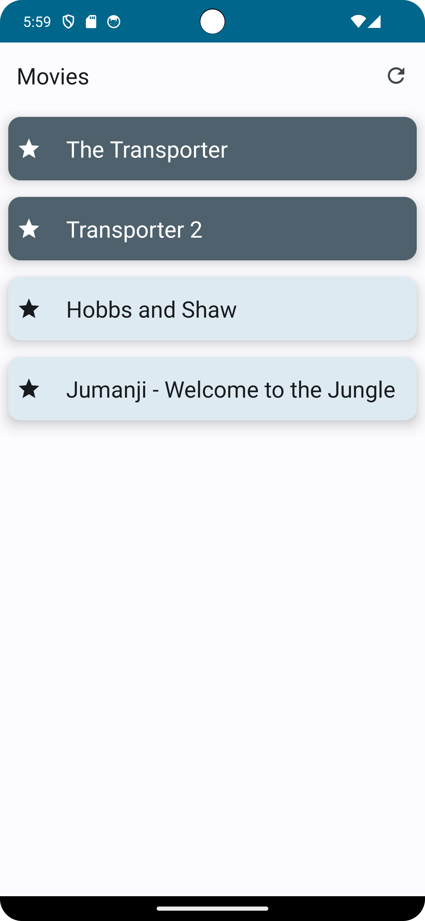
This gives us a movie list that allows us to select movies!
All code changes
CHANGED: app/src/main/java/com/androidbyexample/movies/screens/MovieListUi.kt
package com.androidbyexample.movies.screens

import androidx.compose.foundation.BorderStroke
import androidx.compose.foundation.clickable
import androidx.compose.foundation.combinedClickable
import androidx.compose.foundation.layout.Row
import androidx.compose.foundation.layout.padding
import androidx.compose.foundation.lazy.LazyColumn
import androidx.compose.foundation.lazy.items
import androidx.compose.material3.Card
import androidx.compose.material3.CardDefaults
import androidx.compose.material3.ExperimentalMaterial3Api
import androidx.compose.material3.Icon
import androidx.compose.material3.IconButton
import androidx.compose.material3.MaterialTheme
import androidx.compose.material3.Scaffold
import androidx.compose.material3.Text
import androidx.compose.material3.TopAppBar
import androidx.compose.material3.TopAppBarDefaults
import androidx.compose.material3.contentColorFor
import androidx.compose.runtime.Composable
import androidx.compose.runtime.mutableStateSetOf
import androidx.compose.runtime.saveable.rememberSaveable
import androidx.compose.ui.Alignment
import androidx.compose.ui.Modifier
import androidx.compose.ui.res.painterResource
import androidx.compose.ui.res.stringResource
import androidx.compose.ui.unit.dp
import com.androidbyexample.movies.R
import com.androidbyexample.movies.helper.Display
import com.androidbyexample.movies.repository.MovieDto
import com.androidbyexample.movies.repository.MovieId

@OptIn(ExperimentalMaterial3Api::class)
@Composable
fun MovieListUi(
    movies: List<MovieDto>,
    modifier: Modifier = Modifier,
    onMovieClicked: (MovieDto) -> Unit,
    onResetDatabase: () -> Unit,
) {
    val selectedIds = rememberSaveable { mutableStateSetOf<MovieId>()}

    fun onSelectionToggle(id: MovieId) {
        if (id in selectedIds) {
            selectedIds -= id
        } else {
            selectedIds += id
        }
    }

    fun clearSelectedIds() {
        selectedIds.clear()
    }

    Scaffold(
        topBar = {
            val colors = TopAppBarDefaults.topAppBarColors(
                containerColor = MaterialTheme.colorScheme.primary,
                scrolledContainerColor = MaterialTheme.colorScheme.surfaceContainer,
                titleContentColor = MaterialTheme.colorScheme.onPrimary,
                navigationIconContentColor = MaterialTheme.colorScheme.onPrimary,
                actionIconContentColor = MaterialTheme.colorScheme.onSecondary
            )
            TopAppBar(
                colors = colors,
                title = {
                    Text(text = stringResource(R.string.movies))
                },
                actions = {
                    IconButton(onClick = onResetDatabase) {
                        Icon(
                            painter = painterResource(R.drawable.refresh_24),
                            contentDescription = stringResource(R.string.reset_database),
                        )
                    }
                }
            )
        },
        modifier = modifier,
    ) { innerPadding ->
        LazyColumn(
            modifier = modifier
                .padding(innerPadding)
        ) {
            items(
                items = movies,
                key = { it.id }
            ) { movie ->
                val containerColor =
                    if (movie.id in selectedIds) {
                        MaterialTheme.colorScheme.primaryContainer
                    } else {
                        MaterialTheme.colorScheme.surface
                    }
                val contentColor = MaterialTheme
                    .colorScheme
                    .contentColorFor(containerColor)

                Card(
                    elevation = CardDefaults.cardElevation(
                        defaultElevation = 8.dp,
                    ),
                    colors = CardDefaults.cardColors(
                        containerColor = containerColor,
                        contentColor = contentColor,
                    ),
                    border = BorderStroke(1.dp, MaterialTheme.colorScheme.outlineVariant),
                    modifier = Modifier
                        .padding((8.dp))
                        .combinedClickable(
                            onClick = {
                                if (selectedIds.isEmpty()) {
                                    onMovieClicked(movie)
                                } else {
                                    onSelectionToggle(movie.id)
                                }
                            },
//                  modifier = Modifier.padding((8.dp))
                            onLongClick = {
                                onSelectionToggle(movie.id)
                            },
                        )
                ) {
                    Row(
                        verticalAlignment = Alignment.CenterVertically,
                        modifier = Modifier.padding(8.dp),
                    ) {
                        Icon(
                            painter = painterResource(R.drawable.movie_24),
                            contentDescription = stringResource(R.string.movie),
                            modifier = Modifier.clickable {
                                onSelectionToggle(movie.id)
                            }
                        )
                        Display(text = movie.title)
                    }
                }
            }
        }
    }
}