Compose Lists
Selection
Sometimes you'd like to allow the user to select one or more items in the list and perform an action against them.
This requires:
- A collection (typically a
Set) to track which items are considered "selected" (often just the item id), - A declaration of user interaction that is considered "selecting an item", which will add the id of that item to the "selected" set.
- A declaration of user interaction that is considered navigating to that item's details (if applicable)
- Actions (passed to the
topBarin theScaffold) that should be available when- no items are selected
- one or more items are selected
- Colors to use to indicate an item is selected. We'll use the
primarycolor in the theme, but you could choose a different one, such asprimaryVariantorsecondarycolors.
Let's look an an example UI:
First, we've added an icon at the start of the cards:

How does the user interact with the items?
- Tapping the icon or long-pressing anywhere in the row toggles the selection
- Tapping in the row anywhere except the icon:
- if any items are selected, toggle this item
- if no items are selected, trigger navigation
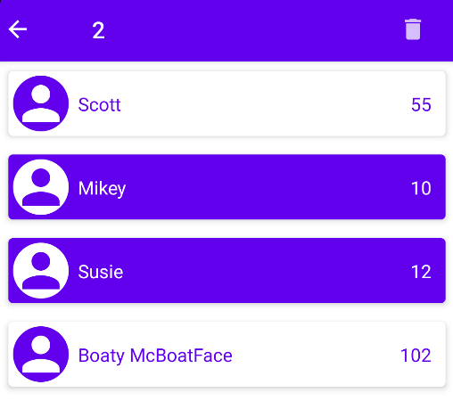
When any items are selected, we change the topBar in the Scaffold to display
- a navigation arrow icon. When pressed, all selections are cleared
- the number of selected items
- selection actions - "delete" in this case (deletes all selected items when tapped)
This alternative bar is called a "contextual" bar, as it depends on the items the user has selected. This presentation is a common convention, but you can set up the contextual bar however you see fit.
We also highlight the selected items in the list. Note how the foreground and background colors are swapped
We'll see the details of how to implement selection as we continue our Movies UI.