Simple Graphics
A custom gauge
Let's build a simple gauge, a little graphical component that displays a value.
First, let's look at our API for the gauge:
show in full file app/src/main/java/com/androidbyexample/compose/graphics/gauge/Gauge.kt
// ...
import androidx.compose.ui.unit.dp

@Composable
fun Gauge(
    outlineColor: Color,
    fillColor: Color,
    outlineWidth: Dp,
    value: Float, // 0f-1f
    modifier: Modifier,
) {
    Canvas(modifier = modifier.padding(8.dp)) {
        val fillHeight = size.height * value
        // ...
}
We're passing in parameters for the fill and outline colors, the width of the
outline (in density-independent pixels), the value we want to display, and our
normal Modifier.
This gauge displays the value "bottom up", filling its rectangular region based on
the passed-in value. We compute this (fillHeight) by multiplying the canvas height by the value.
show in full file app/src/main/java/com/androidbyexample/compose/graphics/gauge/Gauge.kt
// ...

@Composable
fun Gauge(
    // ...
) {
    Canvas(modifier = modifier.padding(8.dp)) {
        val fillHeight = size.height * value
        val offsetY = size.height - fillHeight

        // the Stroke we use to paint the outline needs a float value for width
        // ...
        drawRect(
            color = fillColor,
            topLeft = Offset(0f, offsetY),
            size = Size(size.width, fillHeight),
            style = Fill, // this is the default, but I like being explicit for this
        )
        // ...
    }
}
offsetY defines the top of the filled rectangle representing the value.
When drawing the border, the width needs to be specified in pixels as a float
value. We're passing in a Dp value for the width, so we need to convert it.
show in full file app/src/main/java/com/androidbyexample/compose/graphics/gauge/Gauge.kt
// ...

@Composable
fun Gauge(
    // ...
) {
    Canvas(modifier = modifier.padding(8.dp)) {
        // ...
        val offsetY = size.height - fillHeight

        // the Stroke we use to paint the outline needs a float value for width
        val outlineWidthPx = outlineWidth.toPx()

        // draw the filled part of the gauge first
        // ...
        drawRect(
            // ...
            topLeft = Offset.Zero, // this is a single reusable value of Offset(0, 0)
            size = Size(size.width, size.height),
            style = Stroke(
                join = StrokeJoin.Round,
                width = outlineWidthPx,
            ),
        )
    }
}
Note
The lambda passed into Canvas is called on a DrawScope receiver. This
gives access to the various drawing functions, and DrawScope extends
Density, so you have access to functions like Dp.toPx() inside the
lambda without needing to explicitly call with(LocalDensity.current) { ... }.
To draw the gauge, we need to decide the order in which to draw the border and the fill color. Everything we draw appears on top of anything we've previously drawn. This is known as a "painter's algorithm", because it acts the same way as painting on top of existing (dry) paint.
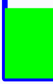
The difference in the order here may seem subtle, but makes a big visual difference. The border stroke width extends outside the rectangle in either direction. If we draw the border first, then the fill, the fill will overlap it in a very undesirable way:
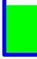
If we draw the fill first, the border will overlap the fill and it will look great:
We use our new gauge like any other composable function:
show in full file app/src/main/java/com/androidbyexample/compose/graphics/gauge/MainActivity.kt
// ...
class MainActivity : ComponentActivity() {
    override fun onCreate(savedInstanceState: Bundle?) {
        // ...
        setContent {
            ComposeGaugeTheme {
// ...
                Scaffold(modifier = Modifier.fillMaxSize()) { innerPadding ->
                    Gauge(
                        outlineColor = Color.Blue,
                        fillColor = Color.Green,
                        outlineWidth = 3.dp,
                        value = 0.6f,
                        modifier = Modifier
                            .padding(innerPadding)
                            .fillMaxSize()
                    )
                }
            }
        }
    }
}
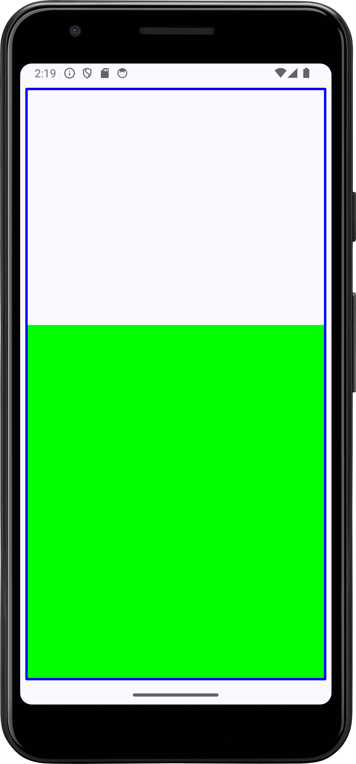
And we get the desired result when we run:
All code changes
ADDED: app/src/main/java/com/androidbyexample/compose/graphics/gauge/Gauge.kt
package com.androidbyexample.compose.graphics.gauge

import androidx.compose.foundation.Canvas
import androidx.compose.foundation.layout.padding
import androidx.compose.runtime.Composable
import androidx.compose.ui.Modifier
import androidx.compose.ui.geometry.Offset
import androidx.compose.ui.geometry.Size
import androidx.compose.ui.graphics.Color
import androidx.compose.ui.graphics.StrokeJoin
import androidx.compose.ui.graphics.drawscope.DrawStyle
import androidx.compose.ui.graphics.drawscope.Fill
import androidx.compose.ui.graphics.drawscope.Stroke
import androidx.compose.ui.platform.LocalDensity
import androidx.compose.ui.unit.Dp
import androidx.compose.ui.unit.dp

@Composable
fun Gauge(
    outlineColor: Color,
    fillColor: Color,
    outlineWidth: Dp,
    value: Float, // 0f-1f
    modifier: Modifier,
) {
    Canvas(modifier = modifier.padding(8.dp)) {
        val fillHeight = size.height * value
        val offsetY = size.height - fillHeight

        // the Stroke we use to paint the outline needs a float value for width
        val outlineWidthPx = outlineWidth.toPx()

        // draw the filled part of the gauge first
        drawRect(
            color = fillColor,
            topLeft = Offset(0f, offsetY),
            size = Size(size.width, fillHeight),
            style = Fill, // this is the default, but I like being explicit for this
        )

        // draw the outline second - this allows the border to overlap
        // Compose uses a "painter's algorithm" for drawing - later draws appear
        //    on top of earlier draws, much like paint added later in on top of
        //    older paint
        drawRect(
            color = outlineColor,
            topLeft = Offset.Zero, // this is a single reusable value of Offset(0, 0)
            size = Size(size.width, size.height),
            style = Stroke(
                join = StrokeJoin.Round,
                width = outlineWidthPx,
            ),
        )
    }
}
CHANGED: app/src/main/java/com/androidbyexample/compose/graphics/gauge/MainActivity.kt
package com.androidbyexample.compose.graphics.gauge

import android.os.Bundle
import androidx.activity.ComponentActivity
import androidx.activity.compose.setContent
import androidx.activity.enableEdgeToEdge
import androidx.compose.foundation.layout.fillMaxSize
import androidx.compose.foundation.layout.padding
import androidx.compose.material3.Scaffold
import androidx.compose.material3.Text
import androidx.compose.runtime.Composable
import androidx.compose.ui.Modifier
import androidx.compose.ui.graphics.Color
import androidx.compose.ui.tooling.preview.Preview
import androidx.compose.ui.unit.dp
import com.androidbyexample.compose.graphics.gauge.ui.theme.ComposeGaugeTheme

class MainActivity : ComponentActivity() {
    override fun onCreate(savedInstanceState: Bundle?) {
        super.onCreate(savedInstanceState)
        enableEdgeToEdge()
        setContent {
            ComposeGaugeTheme {
////                Scaffold(modifier = Modifier.fillMaxSize()) { innerPadding ->
////                }
                Scaffold(modifier = Modifier.fillMaxSize()) { innerPadding ->
                    Gauge(
                        outlineColor = Color.Blue,
                        fillColor = Color.Green,
                        outlineWidth = 3.dp,
                        value = 0.6f,
                        modifier = Modifier
                            .padding(innerPadding)
                            .fillMaxSize()
                    )
                }
            }
        }
    }
}